Independent study / 2025
Reading the room: a design-system study of Claude
An independent teardown of Claude's product design system, reconstructing its type scale, color tokens, and interaction choices to understand what makes an AI assistant feel trustworthy and legible.
Conversational AI is where product design gets hardest. Expectations are unbounded, output is probabilistic, and trust is the whole product. So I did what I do with any system I admire: I took it apart to understand how it works.
This is an independent study of the design system behind Claude. No affiliation, no inside information, just careful observation reconstructed into the type scale, color tokens, and interaction patterns that give the product its voice.
Reconstructing the system
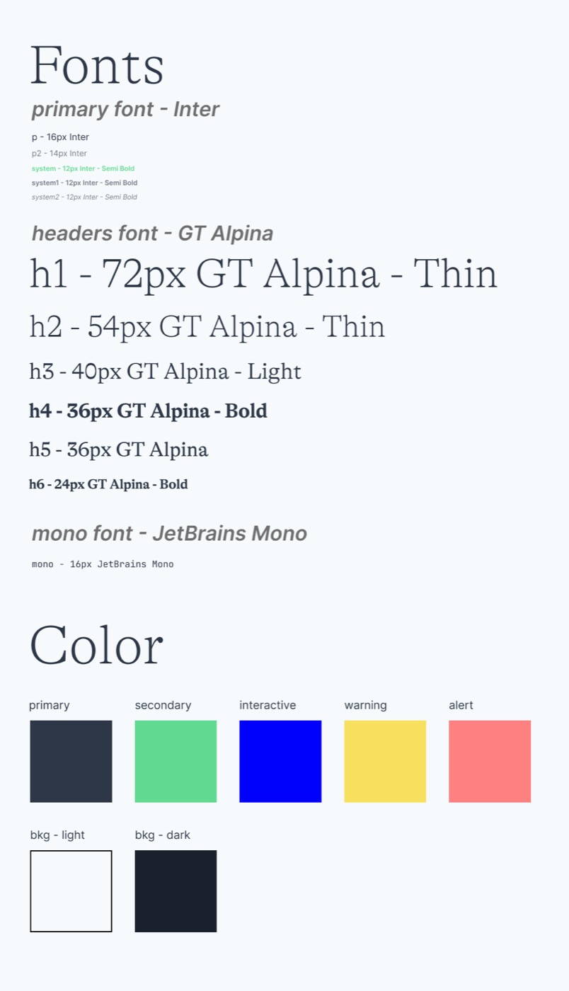
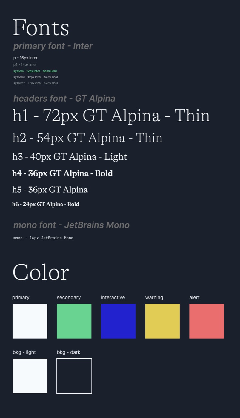
I rebuilt the foundations from the outside in: the typographic hierarchy, the color roles, and how they behave across light and dark. The pairing is deliberate. A warm, high-contrast serif for headers carries personality and authority; a clean grotesque for body and system text keeps long, dense AI responses readable; a monospace anchors code. The color set is small and role-named, which is what lets the product stay consistent as it grows.
What the choices reveal
- Restraint reads as trust. A tight palette and a quiet type system keep the focus on the conversation, not the chrome. For a tool people lean on, calm is a feature.
- Legibility is a safety property. When responses can be long and consequential, type that is comfortable to read is not decoration. It reduces the chance of misreading something that matters.
- A small, role-named token set is how you stay consistent at speed. Naming a color "interactive" rather than "blue" lets the system evolve without fragmenting.
Why I did this
Reverse-engineering a design system is how I build judgment about a product category I intend to lead in. Taking Claude apart sharpened a conviction I carry into my own AI work: the interface is not a wrapper around the model. It is where trust is won or lost, and it deserves the same rigor as anything in the stack underneath it.